
Showing posts with label painting. Show all posts
Showing posts with label painting. Show all posts
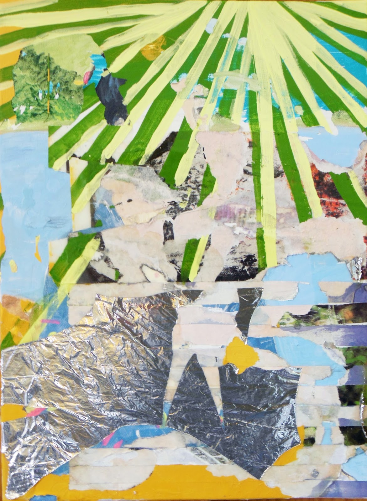
October 31, 2014
September 20, 2014
THANK GOD FOR AWAY GAMES
Finished this one yesterday evening. I've been playing with more muted colors lately. It's a beautiful Saturday, and I'm off to the Market Square Farmers' Market for my weekly dose of produce and people watching. The Vols are playing out of town this weekend, so Knoxville will be a little less busy, a little less crowded, and a little less orange today.

Last Saturday, something flipped the Fall switch on, and mornings have been much cooler. But the cicadas are still singing. It's a nice balance.
Last Saturday, something flipped the Fall switch on, and mornings have been much cooler. But the cicadas are still singing. It's a nice balance.
September 7, 2014


July 17, 2013

July 15, 2013
June 17, 2013
FINALLY
After finishing wedding presents, I finally had some time to get back to what I've been thinking about, and grasping at, and I think I might have gotten somewhere I want to be. Hallelujah.

April 4, 2013
KMA ART ON TAP
Several months ago, I was grabbing Friday evening drinks with some folks when my friend looked at me and said, "Hey, you're an artist. You like beer. Do you want to be a demonstrating artist at a KMA event called Art on Tap?" Of course I said yes. For this event, The Knoxville Museum of Art is joining forces with Central Flats and Taps, The Knoxville Young Professionals, and the Tenth and Blake Beer Company (the craft and import division of Miller Coors) to put on an event geared toward attracting a younger crowd to the museum. Five beers are available for tasting, and each beer will be paired with food from Central Flats and an artist interpreting the beer. I chose Batch 19, a lager crafted from a pre-Prohibition recipe found in the files at Miller Coors. Instead of using Prohibition imagery, I decided to create a 1919 style ad for Batch 19. I gathered old ads online from the time period for inspiration. Below is my sketch. It got pre-approved by Miller Coors. I'm starting my painting early. (The other artists are too) as it will be impossible to execute an entire 30" x 30" painting in the middle of a cocktail party. I'm not even sure that Bob Ross would be up for the challenge. The event is on Tuesday, April 30, and I'm hoping to have the complicated parts complete by then, so I can do less detailed work during the event and not be too distracted. Information for purchasing tickets can be found here. Hops for your Health, y'all!
p.s. Central Flats makes the best balsamic dressing. Go forth and eat salad (or dip your sandwich in it!)

March 15, 2013
THE STRIP: NORTH SIDE, PART I
Of the two sides of Cumberland Avenue, the North side has experienced less modernization and renovation. If you were to walk down that side of the street, you would notice that the buildings are built right up to the sidewalk. Parking and alleys are in the back. Newer buildings across the street are set back with room for extra parking, drive-thru windows, and landscaping in the front. In the case of some of these businesses, they only thing that has changed over the years are the tenants. Brick and mortar remains the same!

The Varsity Barber Show has been a Cumberland Avenue establishment for well over 40 years. Here is a picture shot through the window from the UT yearbooks.

It doesn't look like much has changed. According to an online review, Jack, the barber, is great and will even shave the back of your neck.

Next to the Varsity Barber Shop is this FedEx. It is very cozy with another building that butts up to the back of it. I've often wondered who would open a FedEx that blocks half an apartment building, then I realized that the FedEx wasn't always a retail space. Yearbook ads led me to this picture.
 |
| Traffic on The Strip -- a pain since the 1970s. |
February 5, 2013

April 18, 2012
we'll see
This month marks the first time I have created art specifically for a set of criteria in a call for art. Normally, I make what I want, and then look for calls that seek a similar theme or subject matter to what appears in my drawings and paintings. This month I decided to enter 2 local calls for art. The first one was from Knox Heritage. Each year they hold a photo contest asking for photographs of a particular neighborhood or street in Knoxville. Here are some cool examples of the winning entries from last year.
This year Knox Heritage selected Gay
Street (all buildings, bridges, and viaducts) one of the main
thoroughfares in Downtown Knoxville. The criteria were -- the
building had to be directly facing Gay Street and the building, or
bridge, or viaduct had to be at least 50 years old. I have
photographed Gay Street before. Most of the images I shot on the day I was confronted by the security guard outside the bank were shot on Gay Street, but those buildings weren't old enough. I decided to try
my hand shooting older buildings and ended up submitting a mix of
double exposures and TtV shots.
Here's an example.
 |
| Not one I submitted, but another image from the same roll. |
The second application I submitted was
to the Arts and Culture Alliance of Knoxville seeking entries for their Arts in the Airport show. My work has been juried into this show twice
before.
 |
| Both of my pieces are on the left sides of the walls -- the blue landscape and the smaller landscape. |
Typically, the alliance wants art of
any subject matter and medium. The only restrictions really are in
dimensions and weight of the entered pieces. I wasn't planning on
entering this particular time because of a few sentences on the entry
form. "In honor of the 75th anniversary of McGhee Tyson Airport,
the spring and fall 2012 exhibitions will both share the theme 75
Years of Making Memories in Aviation. Interested artists are
encouraged to broadly interpret the theme in their submissions for
the spring exhibition. The fall exhibition will welcome submissions
that have been especially created in response to the theme."
Yikes. Plane Art.
I have no interest in planes really,
and felt that anything I tried to make about aviation just wouldn't
come out right, because I wouldn't be sincerely invested in the
subject.
Well, as it turned out, last Saturday
night, some possessions I randomly acquired all got together and
whispered, "Sarah, make plane art tomorrow."
I'll explain. About a month ago,
Knoxville had their Friends of the Library book sale. Lately I've
really been plowing through saucy biographies. I enjoy them because,
to be honest, the ones I pick out are like 400 pages of TRUE
CELEBRITY GOSSIP. Exciting, historical, and always a little
scandalous. I went to go stock up for the year. Impulsively, I passed
through the reference book section. My mom is an English teacher and
will never say no to another unique dictionary or book of etymology.
Next to all the dictionaries were the atlases. For no distinct
reason, I poked through them, and tossed the oldest one into my cart.
Everyone needs a grossly outdated atlas with colonial overtones,
right? It looked like it had some loose pages in the back. I assumed
the binding in the back was completely blown and some kind person had
stuffed Africa, Persia, and the Soviet Union back in before giving
the book away. Boy, was I wrong.
A month passed. My mom got her new
dictionaries, and I finished Thomas Hoving's memoirs and began the
biography of The Duchess of Windsor. The atlas sat in the corner of
my living room with some sketch pads and pieces of wood. I don't know
why, but I opened it on Saturday night and hit on the mother lode.
Africa, Persia, and the Soviet Union were not in the back. Instead, I
found a bunch of plane things -- an almost-complete Aeronautical
Chart of the Southeastern United States, an ink and marker drawing of
an Air Force fighter plane, and the Air Force certificates and
appointment letters for a gentleman from 1957. In the atlas was also
a page showing air routes. How could I ignore all of this?
 |
| Air Routes atlas page |
 |
| The goodies. |
I got up early on Sunday, made a giant
pot of coffee, turned on NPR, and got to work.
I knew I wanted to make something with
the atlas, but I wasn't sure I wanted to cut it up yet, so I decided
against using the actual Air Routes map page. However, the
aeronautical chart was missing a chunk already, so I didn't feel so
odd about cutting another piece from it. I briefly considered using
the Air Force certificates and letters somehow, but also felt strange
about that because I don't actually know the person they belong to.
Eventually I settled on taking a piece from the aeronautical chart
and combining it with what interested me the most about the Air
Routes map -- the spider-like network of connecting flights from city
to city enclosed in two connected ovals. I began the laborious task
of tracing all of these lines onto tracing paper so I could transfer
them to the aeronautical chart. I trimmed out and taped a section of
the chart to my drawing board. A few layers of white paint and marble dust gave me the perfect ground to transfer my tracing onto. I spent
the rest of the afternoon painting, and building up colors and layers
of the map -- deciding to highlight towns and radio stations with the
color yellow, emphasizing large circles that signified municipal
airports, and tracing map lines with graphite. After about 9 hours,
this was the end result.
 |
| Everywhere you can fly in 1951. |
I approached plane art on my terms, and
really enjoyed it. I have no idea of the results of either of these
calls for art yet, but we'll see.
March 11, 2012
i hate my painting
I had a realization last week. I hated the painting on my easel. It wasn't finished, but there was no way that would ever happen as long as I continued to ignore it.
 |
| Ignore the glare. I grabbed a quick shot before irreversible artistic impulses |
I had shot a pretty good roll of film, and secured a show of recent photographs for September, BUT I was not painting. So. Last Saturday, I decided I would do something to this painting, because it couldn't possible get any worse. I had no plan, but I covered the oil painting completely with an extremely watered-down layer of cheap-o, white acrylic paint. Refusing to mix with the oil, this watery white beaded and puddled on top of the painting. I didn't know what it would look like when it dried, but I felt better.
Three years ago, I made this thing.

You might consider it a painting. I don't. It's on canvas. It's got paint on it, but it's more of an experiment or a sketch. I made it, but didn't like the result. It kicked around my studio space, and enough other people reacted positively to it that I kept it and never painted over it. Recently I changed out the small paintings in my bedroom. When I first moved, I hung some tiny landscapes at the foot of my bed. Those got exchanged for some of my experimental oil sketches, including the thing.
When the white acrylic paint dried, I looked at the thing with fresh eyes. It's nothing special, just a rubber cement resist with black oil paint that varies in how thinned out it is. I went out to buy some rubber cement to see what it could do to this painting. This is what it looks like right now. It's still not done, but I'm a lot happier with the way it's turning out.

Subscribe to:
Posts (Atom)